Daily Pulse Plots
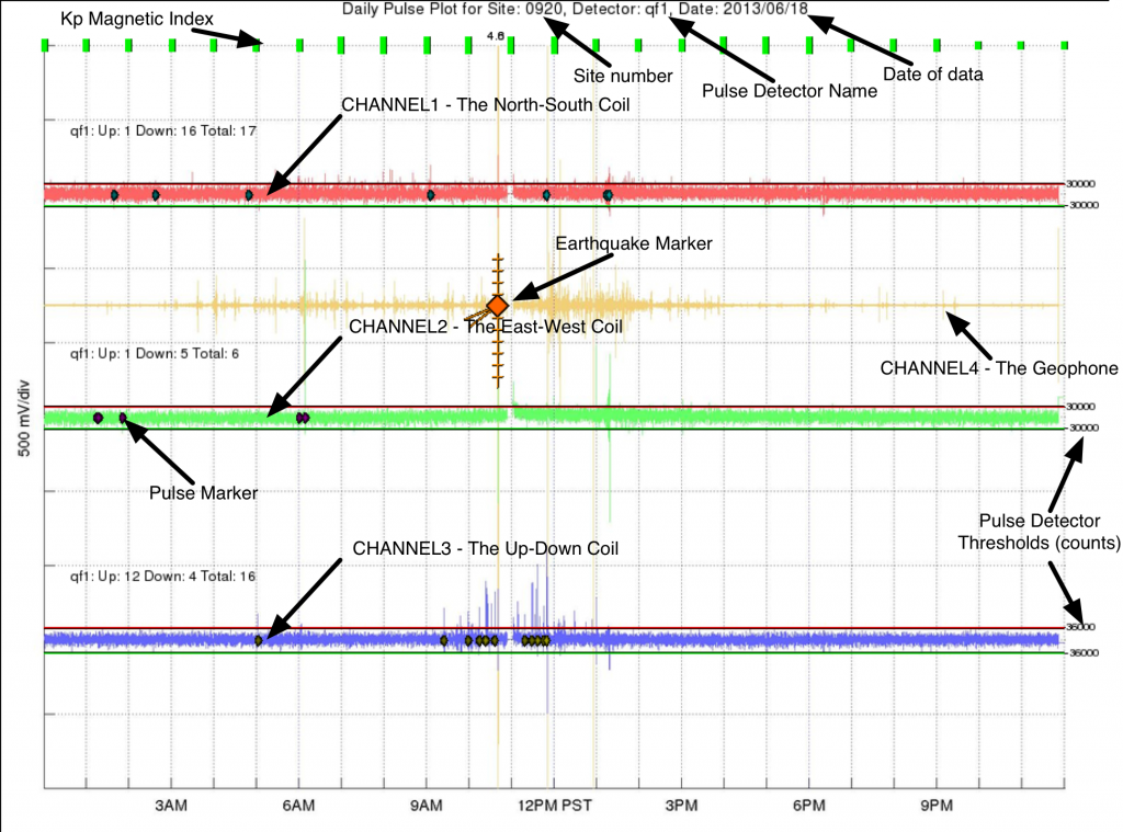
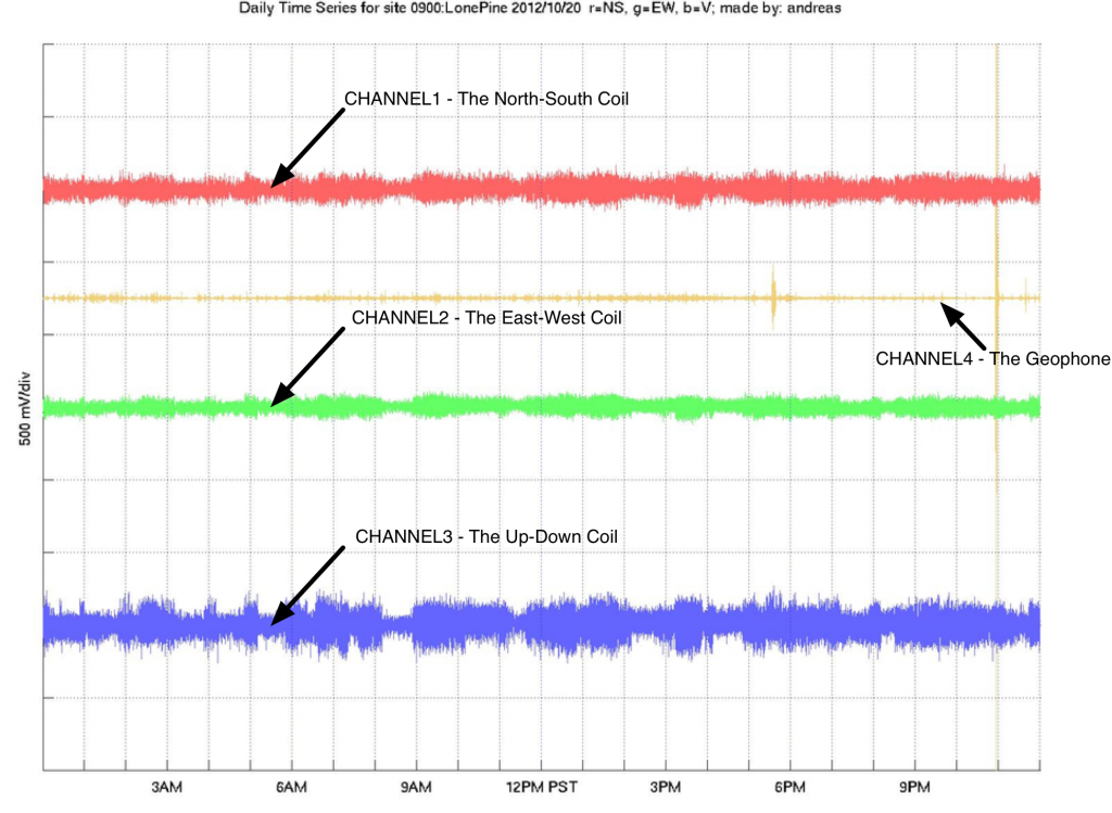
One of the main earthquake pre-cursors that QuakeFinder is pursuing is to monitor for increases in rate of geomagnetic pulsations. We have published a number of peer-reviewed papers which can be viewed here. The Daily Pulse Plot is an important tool for monitoring pulse activity and shows all three magnetometer channels and the pulses that have been counted in them by our software algorithms (described below and in our papers. Daily Pulse Plots are made by compositing layers onto the Time Series plots. An example is shown here:

Kp Planetary Activity
A pair of thresholds is used to identify pulse events in the magnetometer data. The following cartoon of an “Up” pulse has been published as a simple visual of how it works:
 There are six parameters identified in the above plot:

In this plot, a reboot is shown at 11AM where we did maintenance. Layers composited on the Time Series plot to make the Daily Pulse Plot are:
Kp Planetary Activity
- Published by NOAA (The National Oceanic and Atmospheric Administration) as a global value every hour. The level of activity in the Earth’s geomagnetic field is represented by an indicator in the range of 1-3 (Green), 4-6 (Yellow) and 6-9 (Red). The highest levels of activity can generate large signals that are seen across the QuakeFinder network. The Kp indicators are spaced one hour apart and are proportionally taller for higher levels of activity.
- This is a compound Marker that is overlaid onto the geophone trace. In the example above, an m4.5 earthquake is shown. The magnitude is written at the top of the plot, and in this example there are two reports in the ANSS catalog, and therefore two markers are drawn here almost on top of each other. The diamond gets larger for larger quakes, but range, depths, and compass bearing are also given by the mark. Range to an earthquake is depicted by the ladder rungs rising above the diamond, in this case the quake is 44 Km from the site. Each ladder rungs denotes 10 Km. Depth is depicted by the down ladder rungs, each also 10 Km spaced. Compass bearing is shown by the lines angled down to the left, in this case the earthquake is to the Southwest of the site.
- These are tiny diamonds overlaid onto the waveform data. They indicate the that automated detection of a pulse in the data has occurred. See the discussion below for a more complete detection of what a pulse is and how it is detected. For each channel, a pulse count summary is provided up and to the left of the trace. As an example, the annotation for the Blue trace reads ‘qf1: Up: 12 Down : 4 Total: 16. It means that there are sixteen diamonds total overlaid on the blue trace Twelve of them are “Up” pulses, meaning that they protrude up from the signal waveform in the positive direction (up on the plot). The other four pulses are “Down” pulses, meaning that they protrude in the negative (down) direction on the plot.
- These are the Red (high) and Green (low) above and below the waveform data. These serve as a general visual guide as to whether the waveform has risen high (or low) enough to trigger detailed analysis of the pulse. Not all waveforms that cross these thresholds are cataloged. Some have too short (or too long) a duration. Others are bi-polar (see below). Note also that the small number to the right end of the threshold lines. This is the actual threshold value in 24bit ADC counts, where the range of possible values is 0-2^24.
PULSE DETECTION

- + – The pulse detector threshold.
- T0 – The start time of the pulse.
- TP – The time of the peak of the pulse.
- T1 – The end time of the pulse.
- P – The peak amplitude of the pulse.
- E – The energy of the pulse.
Controlling these parameters is the key to pulse detection. For example, setting the minimum pulse width allowed (T1 – T0) is an easy way to block lightning. Details of the pulse detector can be studied in our paper The Pulse Azimuth effect as seen in induction coil magnetometers located in California and Peru 2007–2010, and its Possible Association with Earthquakes

